Generating insights by dimensionality reduction
Independently of their respective sectors or domains, many companies collect a vast amount of data every day. In an early stage, they often see themselves confronted with questions such as:
- Which information may be contained in their data?
- Which insights may be gained from their data?
- Which use-cases can be tackled using their data?
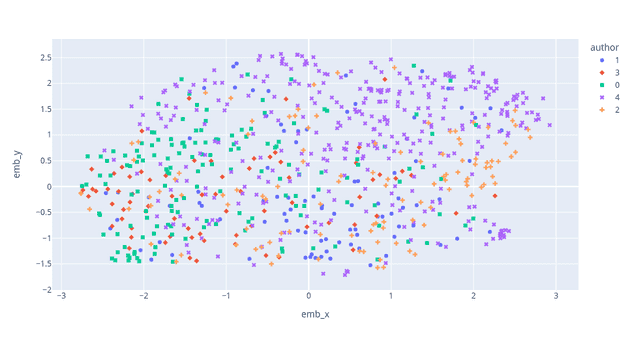
One way to tackle those questions is to explore the data through so-called dimensionality reduction techniques. The idea here is to project the high-dimensional data such as text, images, or even extensive tabular data into a low-dimensional space (Fig. 1).
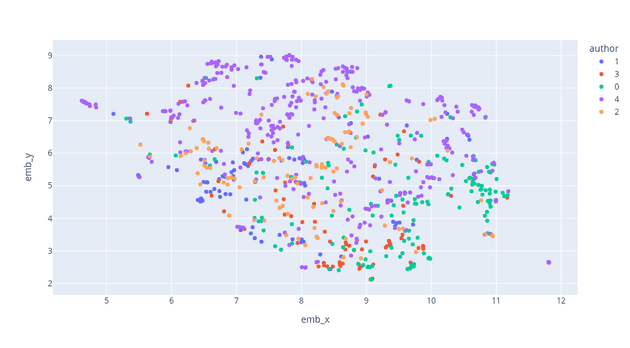
One could, for example, ask himself which categories of bugs make up the bugs in an issue tracker system. This categorization then could help to conceptualize quality assurance measures. Another possible use case would be identifying defects types by analyzing image data from a manufacturing setting, which could again help identify problems in the production line by correlating the defects with other measures such as sensor data.
This post will show you how to categorize text data using transformer models and UMAP. I will use a dataset of WhatsApp text messages in my example. However, I will provide code for a Kaggle dataset to follow along if you don’t want to gather chat messages data from your phone. Of course, you can also perform similar steps using, for example, issues from GitLab or a similar issue tracker or get even more creative.
Gathering data
For creating data, I exported chat logs from my phone by performing the following steps for several chats:
- Open the chat
- Click Options → More → Export Chat
- Place all text files in a shared folder on your computer
Please handle the data and the results you might gain from analyzing it responsibly, especially when sharing any of your findings.
As an alternative, download this dataset from Kaggle.
Installing dependencies
To follow the subsequent instructions, please install the following dependencies.
pip install pandas numpy tqdm torch transformers scikit-learn umap-learn plotlyLoading the data
If you want to follow along using your WhatsApp chat data, use the following code to load the messages into a Pandas Dataframe. You should adjust the FOLDER variable to match your chat logs folder.
import pandas as pd
from datetime import datetime
from pathlib import Path
import pandas as pd
import re

FOLDER = "/path/to/your/datafolder"

LINE_REGEX = re.compile(
    r"^(?P<date_time>\d{2}\.\d{2}\.\d{2}, \d{2}:\d{2}) - (?P<author>[^:]*): (?P<message>.*)$",
    re.MULTILINE)


chat_files = Path(FOLDER).glob("*.txt")

times = []
authors = []
messages = []
for chat_file in chat_files:
    with open(chat_file, "r") as f:
        content = f.read()

    for m in re.finditer(LINE_REGEX, content):
        date_time = datetime.strptime(m.group("date_time"),
                                      "%d.%m.%y, %H:%M")
        times.append(date_time)
        authors.append(m.group("author"))
        messages.append(m.group("message"))


df = pd.DataFrame({"time": times, "author": authors, "message": messages})
Again, alternatively, run the following code to load the Kaggle dataset.
import pandas as pd

BLOGTEXT_CSV = "/path/to/blogtext.csv"

df = pd.read_csv(
                BLOGTEXT_CSV,
                 usecols=["id", "date", "text"],
                 dtype={"id": str, "date": str, "text": str}
                )
df = df.rename(columns={"id": "author", "date": "time", "text": "message"})
df["time"] = pd.to_datetime(df["time"], errors="coerce")
Also, consider excluding authors whose messages do not match the language of the majority of chat messages. In this example, we also limit ourselves to the five most frequent authors to make our plots a little more clear. Additionally, we only use messages that contain more than 20 words and limit the number of messages to 1000.
AUTHOR_BLACKLIST = []

df["word_count"] = df["message"].str.split().apply(len)
df = df[df["word_count"] > 20]
df = df[~df["author"].isin(AUTHOR_BLACKLIST)]

most_common_authors = df["author"].value_counts()[:5].index.values
df = df[df["author"].isin(most_common_authors)]
df["author"] = df["author"].astype('category').cat.codes.astype(str)

if len(df) > 1000:
    df = df.sample(1000)
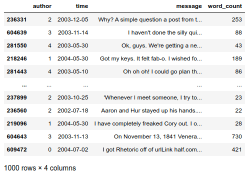
After executing the above code snippet, you should get a data frame in the following format (Fig. 2).
Creating document embeddings
For creating document embeddings, we use a so-called transformer model. Transformers are state-of-the-art neural networks used in natural language processing (NLP). We can use them for mapping text documents, in this case, WhatsApp messages, to a continuous vector representation. For a detailed illustration of how transformers work, see this excellent explanation video. Before executing the code snippet, consider adjusting the used language model to match the language of your text messages. For example, we could use the “dbmdz/bert-base-german-uncased” model to generate embeddings for german text messages. You can view all available models in the Hugging Face model zoo.
import numpy as np
from tqdm import tqdm
import torch
from transformers import BertModel, BertTokenizer, BertConfig

LANGUAGE_MODEL = "bert-base-uncased" # "dbmdz/bert-base-german-uncased"


config = BertConfig.from_pretrained(LANGUAGE_MODEL, output_hidden_states=True)
tokenizer = BertTokenizer.from_pretrained(LANGUAGE_MODEL)
model = BertModel.from_pretrained(LANGUAGE_MODEL, config=config)
model.eval()

embeddings = []
for _, row in tqdm(df.iterrows(), total=len(df)):
    outputs = model(torch.LongTensor(tokenizer.encode(row["message"][:512])).unsqueeze(0))
    hidden_states = outputs[2]
    embeddings.append(torch.mean(hidden_states[-1], dim=1).squeeze().detach().numpy())

embeddings = np.array(embeddings)

print(embeddings.shape)
After executing the code snippet, we have a corresponding continuous vector for each text message that we can use for further analysis. Each vector should consist of 768 floating-point values. Note that we limit the model input to the first 512 characters of the text message as this is the maximum supported input length.
Performing a first analysis
To plot the embedding in two dimensions, we apply UMAP. UMAP is a general-purpose dimensionality reduction technique available in the umap-learn package.
import umap
from sklearn.preprocessing import StandardScaler
import plotly.express as px

def plot_embeddings(embeddings, df, umap_params=[
        {"n_neighbors": 15, "min_dist": 0.05}
]):
    assert len(df) == len(embeddings)
    for params in umap_params:
        reduced_embedding = umap.UMAP(metric='euclidean', **params).fit_transform(embeddings)
        df["emb_x"], df["emb_y"] = reduced_embedding[:,0], reduced_embedding[:,1]
        fig = px.scatter(df, x="emb_x", y="emb_y", hover_data=["message"], color="author")
        fig.show()

plot_embeddings(embeddings, df,
                umap_params=[
                    {"n_neighbors": 5, "min_dist": 0.01},
                    {"n_neighbors": 15, "min_dist": 0.05},
                    {"n_neighbors": 40, "min_dist": 0.2},
                ])
For my data running the above code results in the plots shown below.

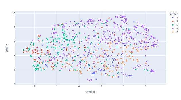
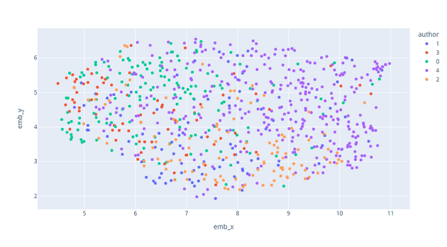
In the first plot, the clusters show us relatively local structures in the data (low values for n_neighbors and min_dist), progressing into a more global view of the data in the following plots (higher values for n_neighbors and min_dist). See the excellent UMAP documentation or this interactive visualization to understand how the parameters influence the reduction. Additionally, the result could be influenced by choosing a different distance metric for calculating distances in high-dimensional space. An example would be using cosine similarity instead to mitigate the influence of the magnitude of vector elements. By looking at the plots, we can already identify different topics such as Events and Travel, COVID-19, tech talk, and more. The more global the view of the data, the more meaningful are the distances between clusters.
Refining the embedding
We could take many measures to get an even more detailed view of the topics present in our data. As an example, I want to show you how to mitigate the influence of different writing styles. For this, we use scikit-learns feature selection capabilities to score the features according to their importance. Concretely we use univariate statistical tests to identify potential correlations between single embedding components and the author. We then use the identified correlations to weight the embedding components and thus mitigate separation caused by different writing styles.
from sklearn import feature_selection

feature_selector = feature_selection.SelectKBest(
                                feature_selection.mutual_info_classif
                                ).fit(embeddings, df["author"])


order = np.argsort(feature_selector.scores_)[::-1]
sorted_scores = feature_selector.scores_[order]
scaled_scores = (feature_selector.scores_ - feature_selector.scores_.min()) / (feature_selector.scores_.max() - feature_selector.scores_.min())
non_author_embeddings = embeddings * (1 - scaled_scores)
author_embeddings = embeddings * scaled_scores
Comparing multiple embeddings
To analyze the influence of our refinement step, we want to compare the raw embedding, the embedding with the mitigated effect of writing style, and an embedding adjusted to be used for author identification. Here we can use UMAP’s AlignedUMAP class which allows for aligning embeddings. Like this, it can facilitate comparing different datasets, the development of data over time, or representations originating from different models.
from sklearn.metrics import silhouette_score

relation_dict = {
    i: i for i in range(len(author_embeddings))
}
aligned_mapper = umap.AlignedUMAP(min_dist=0.1, n_neighbors=40).fit([embeddings, non_author_embeddings, author_embeddings],
                                                                    relations=[relation_dict, relation_dict])

print("Embeddings")
embs = aligned_mapper.embeddings_[0]
print(silhouette_score(embs, df["author"]))
df["emb_x"], df["emb_y"] = embs[:,0], embs[:,1]
fig = px.scatter(df, x="emb_x", y="emb_y", hover_data=["message"], color="author", symbol="author")
fig.show()
print("Non-Author Embeddings")
embs = aligned_mapper.embeddings_[1]
print(silhouette_score(embs, df["author"]))
df["emb_x"], df["emb_y"] = embs[:,0], embs[:,1]
fig = px.scatter(df, x="emb_x", y="emb_y", hover_data=["message"], color="author", symbol="author")
fig.show()
print("Author Embeddings")
embs = aligned_mapper.embeddings_[2]
print(silhouette_score(embs, df["author"]))
df["emb_x"], df["emb_y"] = embs[:,0], embs[:,1]
fig = px.scatter(df, x="emb_x", y="emb_y", hover_data=["message"], color="author", symbol="author")
fig.show()
Running the above code results in the following plots.
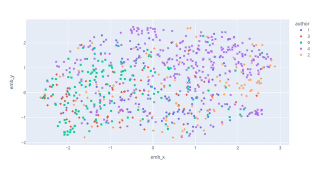
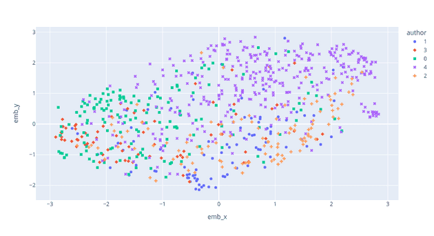
From the plots of the aligned embeddings, we can see that the messages of different authors appear to be slightly more mixed (Fig. 7). Also, we can see that when aiming for separation by author and thus inverting the weighting of the embedding components, we get a much clearer separation by author (Fig. 8). We can also confirm this by looking at the silhouette score, a metric for cluster separation.
Summary
In this post, I showed you how to use transformer models and dimensionality reduction techniques to explore which information may be contained in your data, which use cases can be tackled using your data, and potentially generate insights from your data. Of course, this process is not limited to the chat messages use-case or text data in general. By choosing another embedding model that operates on a different modality, such as images or audio data or that has been trained on other data, you can quickly adapt the procedure to new use-cases.
